
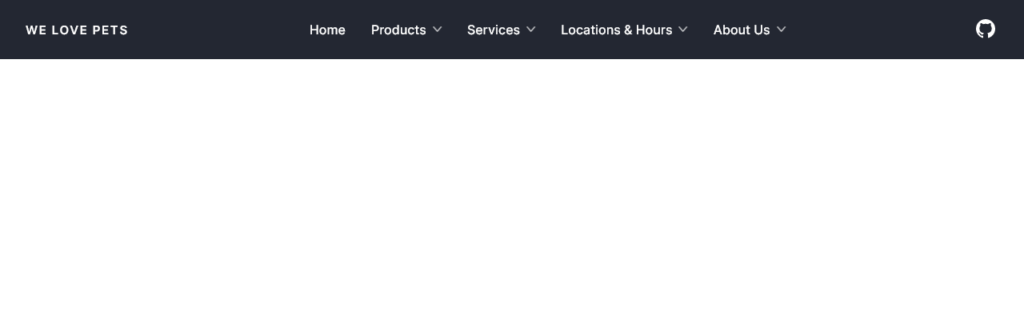
Elegante menu orizontale multi livello responsive.
See the Pen
Responsive and Accessible Multi-Level Menu – jolty.js example by Jolty Labs (@joltylabs)
on CodePen.
HTML
Contenuti
nascondi
<header class="header">
	<a href="/" aria-label="Home" class="logo">WE LOVE PETS</a>
	<div class="mob-nav" id="mob-nav">
		<div data-ui-dialog-backdrop class="mob-nav-backdrop"></div>
		<div data-ui-dialog-content class="mob-nav-content">
			<button type="button" aria-label="Close" class="mob-nav-close" data-ui-dismiss>
				<svg xmlns="http://www.w3.org/2000/svg" fill="none" viewBox="0 0 24 24" stroke-width="1.5" stroke="currentColor">
					<path stroke-linecap="round" stroke-linejoin="round" d="M6 18L18 6M6 6l12 12" />
				</svg>
			</button>
			<a href="/" aria-label="Home" class="logo logo--mob">WE LOVE PETS</a>
			<nav class="nav">
				<ul class="nav-menu">
					<li><a href="#">Home</a></li>
					<li>
						<a href="#">Products</a>
						<ul class="nav-submenu" id="level-1">
							<li>
								<a href="#">Dog Supplies</a>
								<ul class="nav-submenu" id="level-2">
									<li><a href="#">Food & Treats</a></li>
									<li><a href="#">Toys</a></li>
									<li><a href="#">Beds & Furniture</a></li>
									<li><a href="#">Outdoor Supplies</a></li>
									<li>
										<a href="#">Clothing</a>
										<ul class="nav-submenu" id="level-3">
											<li><a href="#">Sweaters and Hoodies</a></li>
											<li><a href="#">Raincoats</a></li>
											<li><a href="#">T-Shirts</a></li>
											<li><a href="#">Booties</a></li>
											<li><a href="#">Hats/Caps</a></li>
										</ul>
									</li>
								</ul>
							</li>

							<li>
								<a href="#">Cat Supplies</a>
								<ul class="nav-submenu" id="level-2-2">
									<li><a href="#">Food & Treats</a></li>
									<li><a href="#">Toys</a></li>
									<li><a href="#">Beds & Furniture</a></li>
								</ul>
							</li>

							<li>
								<a href="#">Bird Supplies</a>
								<ul class="nav-submenu" id="level-2-3">
									<li><a href="#">Food & Treats</a></li>
									<li><a href="#">Toys</a></li>
									<li><a href="#">Furniture</a></li>
								</ul>
							</li>
							<li>
								<a href="#">Fish Supplies</a>
								<ul class="nav-submenu" id="level-2-4">
									<li><a href="#">Food</a></li>
									<li><a href="#">Aquariums</a></li>
									<li><a href="#">Rocks & Decorations</a></li>
								</ul>
							</li>
						</ul>
					</li>

					<li>
						<a href="#">Services</a>
						<ul class="nav-submenu">
							<li>
								<a href="#">Grooming</a>
								<ul class="nav-submenu">
									<li><a href="#">Coat Care</a></li>
									<li><a href="#">Nail Care</a></li>
									<li><a href="#">Doggie Deluxe Spa Day</a></li>
								</ul>
							</li>
							<li>
								<a href="#">Boarding</a>
								<ul class="nav-submenu">
									<li><a href="#">Short Term Boarding</a></li>
									<li><a href="#">Doggie Daycare</a></li>
								</ul>
							</li>
						</ul>
					</li>
					<li>
						<a href="#">Locations & Hours</a>
						<ul class="nav-submenu">
							<li><a href="#">North America</a></li>
							<li><a href="#">Europe</a></li>
						</ul>
					</li>
					<li>
						<a href="#">About Us</a>
						<ul class="nav-submenu">
							<li><a href="#">Our Team</a></li>
							<li><a href="#">Contact Us</a></li>
						</ul>
					</li>
				</ul>
			</nav>
		</div>
	</div>
	<a href="https://github.com/joltylabs/jolty" target="_blank" aria-label="github" class="github">
		<svg xmlns="http://www.w3.org/2000/svg" width="24" height="24" viewBox="0 0 24 24">
			<path d="M12 0c-6.626 0-12 5.373-12 12 0 5.302 3.438 9.8 8.207 11.387.599.111.793-.261.793-.577v-2.234c-3.338.726-4.033-1.416-4.033-1.416-.546-1.387-1.333-1.756-1.333-1.756-1.089-.745.083-.729.083-.729 1.205.084 1.839 1.237 1.839 1.237 1.07 1.834 2.807 1.304 3.492.997.107-.775.418-1.305.762-1.604-2.665-.305-5.467-1.334-5.467-5.931 0-1.311.469-2.381 1.236-3.221-.124-.303-.535-1.524.117-3.176 0 0 1.008-.322 3.301 1.23.957-.266 1.983-.399 3.003-.404 1.02.005 2.047.138 3.006.404 2.291-1.552 3.297-1.23 3.297-1.23.653 1.653.242 2.874.118 3.176.77.84 1.235 1.911 1.235 3.221 0 4.609-2.807 5.624-5.479 5.921.43.372.823 1.102.823 2.222v3.293c0 .319.192.694.801.576 4.765-1.589 8.199-6.086 8.199-11.386 0-6.627-5.373-12-12-12z"></path>
		</svg>
	</a>
	<button type="button" aria-label="Navigation" class="mob-nav-toggler" data-ui-toggle="mob-nav">
		<svg xmlns="http://www.w3.org/2000/svg" viewBox="0 0 37.47 34.09" width="37.47" height="34.09" class="w-4.5 h-auto stroke-current">
			<line stroke-width="4" y1="2" x2="37.47" y2="2"></line>
			<line stroke-width="4" y1="32.09" x2="37.47" y2="32.09"></line>
			<line stroke-width="4" y1="17.04" x2="37.47" y2="17.04"></line>
		</svg>
	</button>
</header>
CSS
@import url("https://fonts.googleapis.com/css2?family=Inter:wght@400;500;600&display=swap");

[hidden] {
	display: none !important;
}
body {
	font-family: Inter, sans-serif;
}

a {
	text-decoration: none;
	color: inherit;
}

:where(dialog, [popover]) {
	margin: 0;
	padding: 0;
	position: fixed;
	inset: 0;
	max-width: 100%;
	max-height: 100%;
	width: auto;
	height: auto;
	background-color: transparent;
	color: inherit;
	overflow: unset;
	border-width: 0;
	&::backdrop {
		opacity: 0;
	}
}

.header {
	margin: 0 auto;
	padding: 0 1.5rem;
	background-color: rgb(35 39 50);
	color: white;
	display: flex;
	align-items: center;
	justify-content: space-between;
}
@media (min-width: 1024px) {
	.header {
		padding: 1rem 2rem;
	}
}

.github {
	padding: 0.5rem;
	margin-right: -0.5rem;
}
.github svg {
	width: 2rem;
	fill: white;
}

.mob-nav-toggler {
	appearance: none;
	border: none;
	background: transparent;
	padding: 1rem;
	margin-right: -1rem;
	cursor: pointer;
}
.mob-nav-toggler svg {
	width: 1.25rem;
	fill: white;
	stroke: white;
}
@media (min-width: 1024px) {
	.mob-nav-toggler {
		display: none;
	}
}

.logo {
	font-weight: bold;
	font-size: 0.95rem;
	text-transform: uppercase;
	letter-spacing: 0.1em;
	margin-right: auto;
	display: block;
}
@media (min-width: 1024px) {
	.logo {
		margin-right: 0;
	}
}

.nav-menu {
	font-weight: 500;
}

:is(.nav-menu, .nav-submenu) a {
	padding: 0.6rem 1rem;
	display: block;
}
@media (min-width: 1024px) {
	:is(.nav-menu, .nav-submenu) a {
		padding: 0.5rem 1rem;
	}
}
.nav-submenu {
	background: white;
	color: black;
	border-radius: 0.3rem;
	font-weight: 400;
	font-size: calc(15 / 16 * 1rem);
}
.nav-submenu:not(.ui-shown) {
	display: none;
}
.nav ul > li > a:not(:only-child)::after {
	content: "";
	background-image: url("data:image/svg+xml;base64,PD94bWwgdmVyc2lvbj0iMS4wIiBlbmNvZGluZz0iVVRGLTgiPz48c3ZnIGlkPSJMYXllcl8yIiB4bWxucz0iaHR0cDovL3d3dy53My5vcmcvMjAwMC9zdmciIHZpZXdCb3g9IjAgMCAxMi44OCAyMi43NiI+PHBhdGggZD0ibTEuNSwyMi43NmMtLjM4LDAtLjc3LS4xNS0xLjA2LS40NC0uNTktLjU5LS41OS0xLjU0LDAtMi4xMmw4LjgyLTguODJMLjQ0LDIuNTZDLS4xNSwxLjk4LS4xNSwxLjAyLjQ0LjQ0LDEuMDMtLjE1LDEuOTctLjE1LDIuNTYuNDRsOS44OCw5Ljg4Yy41OS41OS41OSwxLjU0LDAsMi4xMkwyLjU2LDIyLjMyYy0uMjkuMjktLjY4LjQ0LTEuMDYuNDRaIi8+PC9zdmc+");
	display: block;
	width: 0.7rem;
	background-size: contain;
	aspect-ratio: 1;
	background-position: center;
	background-repeat: no-repeat;
	opacity: 0.75;
}
@media (max-width: 1023px) {
	.nav a {
		display: flex;
		align-items: center;
		justify-content: space-between;
		gap: 0.5rem;
	}
	.nav ul > li > a:not(:only-child)::after {
		rotate: 90deg;
		transition: scale 0.2s;
	}
	.nav ul > li > a.ui-active:not(:only-child)::after {
		scale: -1 1;
	}
	.mob-nav {
		position: fixed;
		inset: 0;
		z-index: 20;
		display: block;
	}
	.mob-nav-backdrop {
		position: absolute;
		inset: 0;
		z-index: -1;
		background-color: rgba(0, 0, 0, 0.5);
		transition-duration: 0.2s;
		transition-property: opacity, translate;
		transition-timing-function: cubic-bezier(0.39, 0.575, 0.565, 1);
		opacity: 0;
	}
	.mob-nav-backdrop.ui-active {
		opacity: 1;
	}
	.mob-nav-close {
		all: unset;
		position: absolute;
		top: 0.5rem;
		right: 0.5rem;
		/* translate: 100%; */
		padding: 0.6rem;
		cursor: pointer;
		/* background-color: rgb(35 39 50 / 0.1); */
	}
	.mob-nav-close svg {
		fill: none;
		width: 1.75rem;
		apsect-ratio: 1;
		stroke: rgb(35 39 50 / 1);
		display: block;
		cursor: pointer;
	}

	.mob-nav-content {
		background-color: #fff;
		width: fit-content;
		height: 100%;
		padding: 1.5rem 0.5rem;
		min-width: 14rem;
		position: relative;
		overflow: auto;
	}
	.mob-nav-content.ui-enter-active,
	.mob-nav-content.ui-leave-active {
		transition-duration: 0.2s;
		transition-property: opacity, translate;
		transition-timing-function: cubic-bezier(0.39, 0.575, 0.565, 1);
	}
	.mob-nav-content.ui-enter-from,
	.mob-nav-content.ui-leave-to {
		opacity: 0;
		translate: -100% 0;
	}
	.mob-nav-content.ui-enter-to,
	.mob-nav-content.ui-leave-from {
		opacity: 1;
		translate: 0%;
	}
	.logo--mob {
		margin-bottom: 2rem;
		padding-left: 1rem;
	}
	.nav-submenu {
		padding-left: 0.5rem;
	}
	.nav-submenu::before,
	.nav-submenu::after {
		content: "";
		height: 0.25rem;
		display: block;
	}
	.nav-submenu::after {
		height: 0.5rem;
	}
	.nav-submenu.ui-enter-active,
	.nav-submenu.ui-leave-active {
		transition-duration: 0.2s;
		transition-property: opacity, height;
		transition-timing-function: ease-in-out;
		overflow: hidden;
	}
	.nav-submenu.ui-enter-from,
	.nav-submenu.ui-leave-to {
		opacity: 0;
		height: 0;
	}
	.nav-submenu.ui-enter-to,
	.nav-submenu.ui-leave-from {
		opacity: 1;
		height: var(--ui-transition-height);
	}
}
@media (min-width: 1024px) {
	.mob-nav-close,
	.logo--mob {
		display: none;
	}
	.nav-menu > li > a {
		display: flex;
		align-items: center;
		justify-content: space-between;
		gap: 0.5rem;
	}
	.nav-menu > li > a::after {
		width: 0.5rem;
		rotate: 90deg;
		filter: invert(1);
	}
	.nav-menu {
		display: flex;
		align-items: center;
		justify-content: center;
	}
	.nav-submenu {
		--ui-dropdown-arrow-offset: 0rem;
		--ui-dropdown-arrow-padding: 0.8rem;
		--ui-dropdown-arrow-width: 0.4rem;
		--ui-dropdown-arrow-height: 0.4rem;
		--ui-dropdown-placement: bottom-start;
		padding: 0.5rem 0.25rem;
		box-shadow: rgba(0, 0, 0, 0.05) 0px 0px 0px 1px,
			rgba(0, 0, 0, 0.1) 0px 10px 15px -3px, rgba(0, 0, 0, 0.1) 0px 4px 6px -4px;
	}
	.nav-submenu > li {
		position: relative;
	}
	.nav-submenu > li > a {
		display: flex;
		justify-content: space-between;
		align-items: center;
		gap: 0.5rem;
		padding: 0.5rem 0.75rem 0.5rem 0.75rem;
		border-radius: 0.3rem;
		outline: none;
	}
	.nav-submenu > li > a:is(:hover, :focus-visible) {
		background-color: rgba(0, 0, 0, 0.05);
	}
	.nav-submenu > li > a::after {
		opacity: 0.75;
	}
	.nav-submenu .nav-submenu {
		--ui-dropdown-placement: right-start;
		--ui-dropdown-padding: -0.25rem;
		--ui-dropdown-offset: -0.25rem;
		--ui-dropdown-flip: false;
		--ui-dropdown-sticky: true;
	}
	.nav-submenu.ui-enter-active,
	.nav-submenu.ui-leave-active {
		transition-duration: 0.2s;
		transition-property: opacity, scale;
		transition-timing-function: ease-in-out;
		transform-origin: var(--ui-dropdown-transform-origin);
	}
	.nav-submenu.ui-enter-from,
	.nav-submenu.ui-leave-to {
		opacity: 0;
		scale: 0.95;
	}
	[data-ui-floating="dropdown"]::backdrop {
		transition: all 0.15s ease-in-out;
		background-color: rgb(17 24 38 / 0.05);
		opacity: 0;
	}
	[data-ui-floating="dropdown"]:has(> .ui-active)::backdrop {
		opacity: 1;
	}
}
JAVASCRIPT
// Documentation
// https://jolty.io/

const { Dropdown, Dialog, Tablist } = jolty;

const isTouchDevice = window.matchMedia("(any-pointer:coarse)").matches;

new Dialog("#mob-nav", {
	shown: false,
	breakpoints: {
		1024: {
			destroy: true
		}
	}
});

document.querySelectorAll(".nav-submenu").forEach((submenu) => {
	new Dropdown(submenu, {
		toggler: submenu.previousElementSibling,
		delay: 100,
		itemClickHide: false,
		items: ":scope > li > a",
		trigger: isTouchDevice ? "click" : "hover",
		arrowActivation: submenu.parentNode.closest(".nav-submenu") ? "x" : "y",
		hideMode: "class-shown",
		destroy: true,
		breakpoints: {
			1024: {
				destroy: false
			}
		}
	});
});

document.querySelectorAll(".nav-submenu, .nav-menu").forEach((submenu) => {
	new Tablist(submenu, {
		tab: "a:not(:only-child)",
		tabpanel: ".nav-submenu",
		hideMode: "class-shown",
		breakpoints: {
			1024: {
				destroy: true
			}
		}
	});
});
